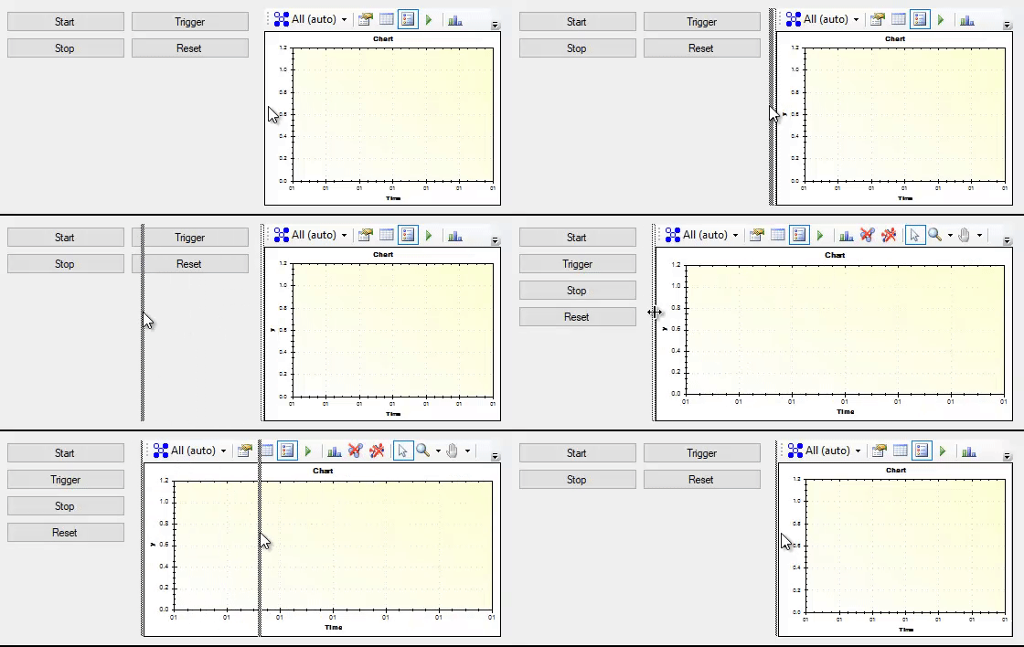
The Split container control provides two panels with a movable bar between them. Dragging the movable bar resizes the amount of space allocated to each of the panels. The panels can be stacked horizontally or vertically within the split container control.

The split container control provides two panels that can be resized by the user.
| Property | Access | Type | Method | Description |
|---|---|---|---|---|
| Panel1 | Design-only | SplitterPanel | — | Layout properties for the left (Orientation is Horizontal) or top (Orientation is Vertical) panel. |
| Panel2 | Design-only | SplitterPanel | — | Layout properties for the second panel. |
| Orientation | Design-only | Orientation | — | Determines if the splitter is horizontal (panels stacked above each other) or vertical (panels stacked beside each other). |
| FixedPanel | Design-only | FixedPanel | — | Determines which panel (if any) remains the same size when the control is resized. Available options: None — neither panel is fixed, resizing affects both panels; Panel1 — the left or top panel is fixed, resizing affects only the right or bottom panel; Panel2 — the right or bottom panel is fixed, resizing affects only the left or bottom. |
| IsSplitterFixed | Design-only | bool | — | Determines if the user is able to move the splitter at run-time. |
| Panel1Collapsed | Design-only | bool | — | Determines if the left or top panel is visible. |
| Panel1MinSize | Design-only | Integer | — | Sets the minimum size for the left or top panel. |
| Panel2Collapsed | Design-only | bool | — | Determines if the right or bottom panel is visible. |
| Panel2MinSize | Design-only | Integer | — | Sets the minimum size for the right or bottom panel. |
| SplitterDistance | Design-only | Integer | — | Sets the initial position of the splitter. |
| SplitterIncrement | Design-only | Integer | — | Sets the granularity of the splitter position, in pixels. |
| SplitterWidth | Design-only | Integer | — | Sets the width of the splitter bar, in pixels. |
The split container supports all the common control properties.


