Dynamic control layout tells MegunoLink how to adjust the layout of controls on an Interface Panel visualizer when the size of the visualizer changes. It is useful to ensure all the controls remain accessible when used on computers with smaller displays.
There are 4 methods for dealing with control layout as the size of the visualizer window changes:
- scroll bars,
- anchoring,
- docking, and
- flow layout panel.
The first 3 options are implemented by setting properties on controls. The Flow Layout Panel is a control that you can add to your Interface Panel using the Designer. Combine the different options to achieve the layout you want.
Control Layout Properties
The following properties can be edited in the Designer to control layout.
| Property | Type | Available Values | Default | Description |
|---|---|---|---|---|
| Anchor | AnchorStyles | Top, Left, Bottom, Right | Top, Left | Use the Anchor property to define how a control is automatically resized as its parent control is resized. Anchoring a control to its parent control ensures that the anchored edges remain in the same position relative to the edges of the parent control when the parent control is resized.
You can anchor a control to one or more edges of its container. For example, if you anchor a button to both Top and Bottom edges, the height of the button will be changed to maintain the distance to the top and bottom edges of the parent control. |
| AutoSize | bool | True | False | False | Determines if the control resizes automatically based on its contents. |
| AutoSizeMode | AutoSizeMode | GrowOnly | GrowAndShrink | GrowOnly | Specifies how a control behaves when its AutoSize property is True. If GrowOnly the control will get larger to accommodate its content, but never smaller than the Size property. If GrowAndShrink the control will get bigger or smaller (but not bigger than MaximumSize or smaller than MinimumSize) |
| Dock | string | Top | Left | Bottom | Right | Fill | None | None | The control will be docked to an edge of its parent, or fill the space remaining after other controls are docked. |
| Location | Point | — | — | Position of the control, relative to its parent. |
| Margin | Padding | — | 3 | Sets the space between adjacent controls inside layout containers (such as the (Flow Layout Panel). |
| MaximumSize | Size | — | 0, 0 | The largest size of the control when automatic sizing is enabled. |
| MinimumSize | Size | — | 0, 0 | The smallest size of the control when automatic sizing is enabled. |
| Padding | Padding | — | 0, 0, 0, 0 | The amount of space between the control chrome and its content. |
| Size | Size | — | — | The size of the control. |
Layout Examples
Scroll Bar Layout
When a container control’s AutoScroll property is True scroll-bars will be shown automatically if the size of the container becomes smaller than the controls inside it. This applies to:
- Design surface
- Panel
- Flow Layout Panel
- Split Container
- Tab Control
- Table Layout Panel

Enable the AutoScroll property to automatically add scroll bars if a container is smaller than its contents.

Scroll bars are automatically added when the contents are larger than the container
Anchoring Layout
Anchoring locks the distance between one edge of a control and the same edge on its parent. For example, if you anchor the left and right edges of a button on the design surface then the size of the button will grow and shrink as the Interface Panel window is resized.

The Anchor property causes the edges of a control to maintain a constant distance to their parent when the parent container is resized.

Controls anchored to the edge of their parent container move with the container. Here, the two right buttons are anchored to the right edge of the design surface; the graph is anchored to all four edges.
Docking Layout
Docking a control attaches it either to one edge of its parent container, or causes it to fill its parent container. The control size will change automatically when the parent is resized. A common arrangement is to dock a Panel container to one edge of the design surface and fill the remainder with another control. The Panel provides a container for other controls. Turn on AutoScroll and scroll bars will appear automatically if the Panel becomes smaller than the controls inside it.

Controls can be docked to one edge, or fill, their parent container.

A purple Panel control is docked to the top edge with a graph Docked to fill the remaining space.
Flow Layout Panel
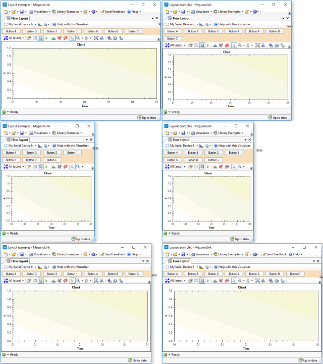
The Flow Layout Panel is a handy container for other controls. It will layout its content from left to right wrapping the controls to a new line if the Flow Layout Panel is too narrow for its content, by default. Use the FlowDirection property to control the layout direction.
When AutoSize is true, the Flow Layout Panel will grow to accommodate its contents. The Flow Layout Panel is commonly docked to an edge of its parent container with a second control filling the remaining space. This helps make sure the controls inside the panel remain visible when the Interface Panel changes size.
Use the child control’s Margin property to control the spacing between children. For more control over the layout, use a Panel container.

Use a Flow Layout Panel to automatically arrange a collection of controls

An orange Flow Layout Panel is docked to the top edge and set to auto-size. The graph is docked to fill the remaining space.


